The brain processes countless amounts of data a day, with 90% of that data being visual. We can process visual information much faster than information in other forms.
We are living in an era of big data and it’s difficult for us to understand large amounts of data in rows and columns. But when we try to understand big data using visualizations, it’s much easier to process.
Let’s look at the importance of data visualization in marketing and share some common types of data visualization you can use.
What are Data Visualizations?
Data visualizations are graphical representations of data and play a vital role in understanding this data. We can explore data using different visual elements like charts, graphs, plots, maps, and more. These pictorial visualizations help us summarize unseen patterns.
Here are some reasons why data visualizations are crucial for marketing analytics teams:
- They present the data insights in ways that help business owners make smarter and faster decisions
- They create a story from raw data to establish business goals
- They help business owners focus on business insights
- Good visualization helps unveil various patterns, trends, and correlations in data. These patterns help stakeholders and decision-makers make better business decisions.
- With various visualizations, decision-makers can easily compose data analysis reports.
- Visuals help build different business strategies and growth recommendations.
Types of Data Visualization
There are many types of data visualizations. Some of the most popular include:
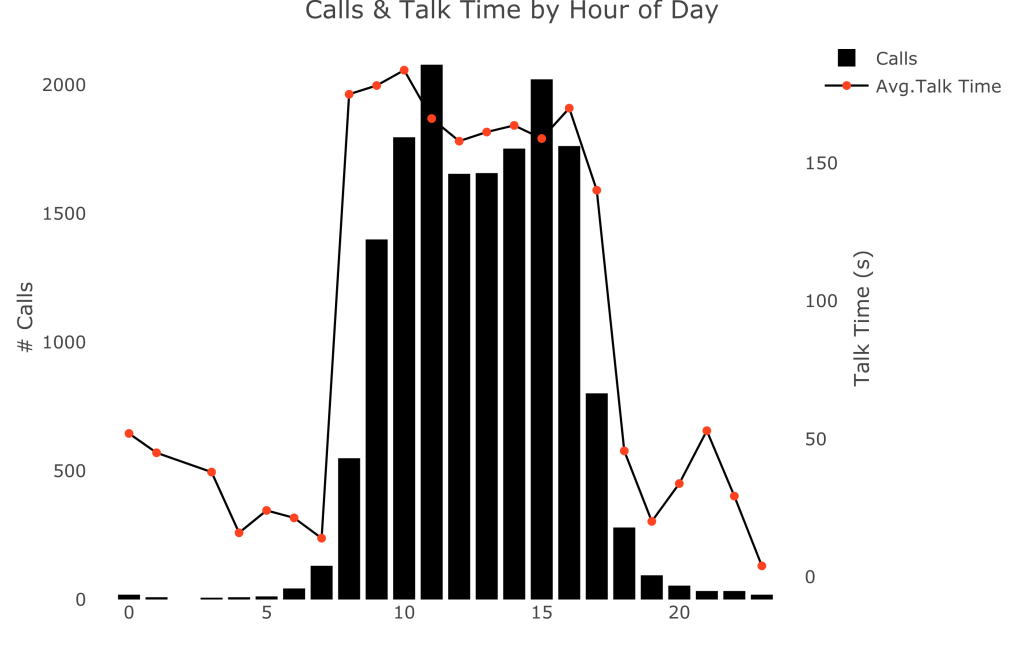
Bar Graphs
A bar graph presents categorical data with rectangular bars. We can count the values of various categories using bar graphs. The length or height of bars is proportional to the count of the category.
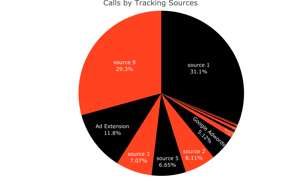
Pie Charts
A pie chart is a circular chart that uses pie slices to show the relative size of categorical data. The arc length of each pie slice is proportional to the count of the category. There are different variants of pie charts available.
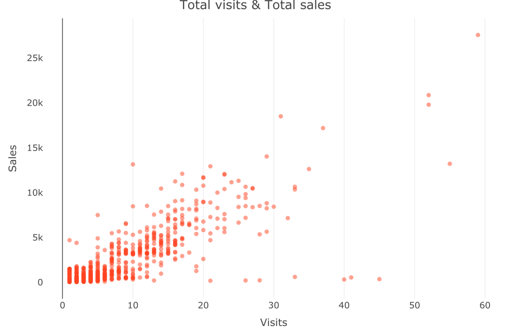
Scatter Plots
A scatter plot shows the relationship between two variables or categories of data. We use scatter plots to find a correlation between continuous variables.
Line Charts
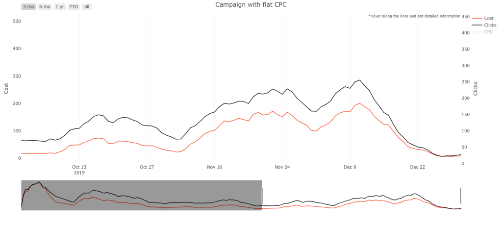
We use line charts to visualize data that changes over time. It works with continuous data and represents a series of data points connected by a straight line.
Heat Map
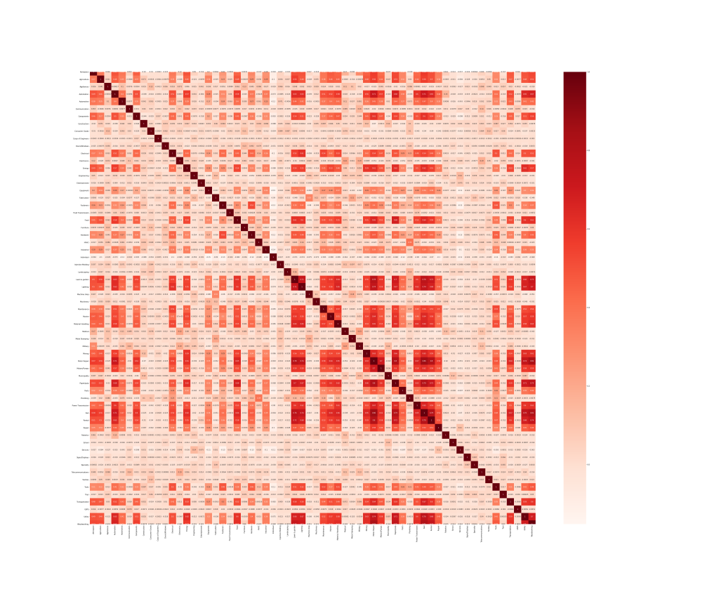
A heatmap is a graphical representation in which we use colors to represent data values that communicate the relationship between two variables. Values of correlation are between -1 to 1. 1 denotes perfect positive correlation. 0 means no correlation and -1 means the highest negative correlation.
Bubble Chart
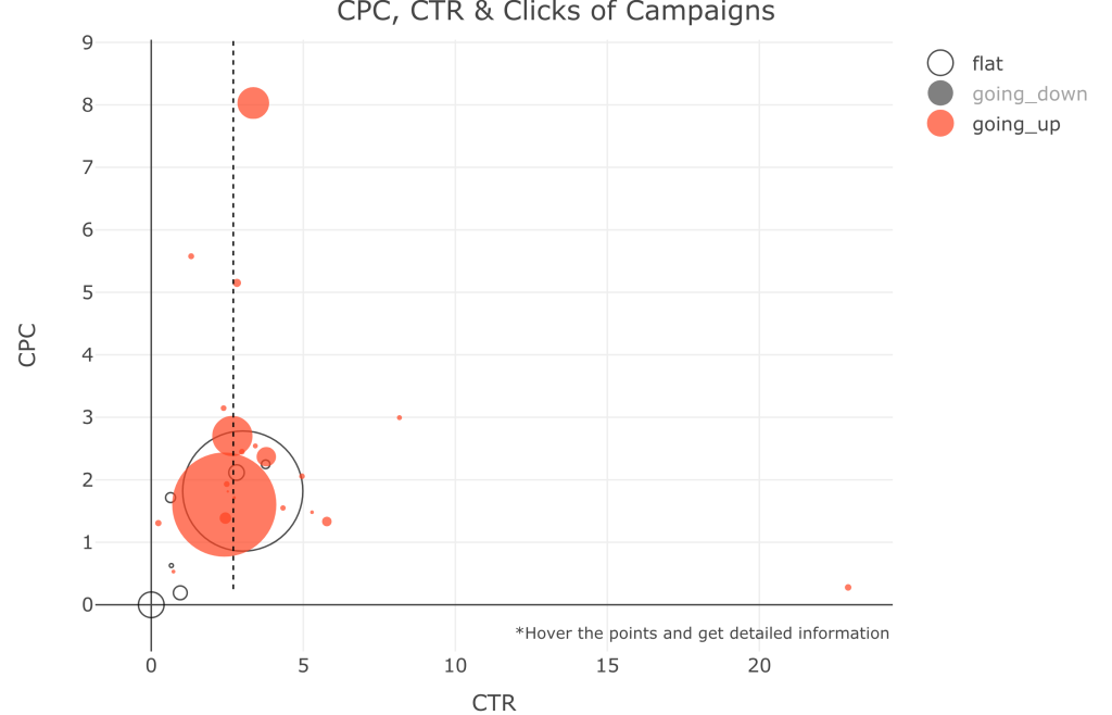
A bubble chart represents two to four-dimensional information on a two-dimensional plot with multiple bubbles. The size of the bubble and color of the bubble represents the third and fourth dimensions.
5 Benefits of Data Visualization in Marketing
Data visualization is a boost in marketing analytics. It helps draw a clear picture of business growth. Here are five of the main benefits of data visualization in marketing:
Pattern and Trend Analysis
We can interpret various patterns and trends analysis like sales analysis, market research analysis, customer analysis, defect analysis, cost analysis, and forecasting using visuals and reports. These analyses work as a pillar for marketing and sales.
Increases Productivity and Sales
The main focus of any business is the increase in productivity and sales and pictorial information plates a vital role in achieving this. Timely and well-organized visual information helps decision-makers take action quickly.
Shows Creativity
Data visualization gives us a way to represent data and analysis creatively. We use different graphs, colors, patterns, and interactive visuals to decipher this data.
Improves Reporting
Reporting is the most obvious use of data visualizations. Results displayed in various graphs and pictures are impactful and well communicated. Compared to traditional methods, visualizations improve report engagement.
Effective & Timely Communication
Communication is very important in marketing. Good communicative reports and visuals boost confidence and motivation. In addition, they have a positive impact on employees, clients, and higher management. Good visualizations also save a lot of time and make reports easier to understand. After all, time is money!
Data Visualization Best Practices
It’s important to understand which data visualization is best for presenting your data. With wrong visuals, everything can go wrong. You should spend some time experimenting with which data visualizations are best for you.
Here are some best practices for your next data visualization:
Avoid Cluttered Data
Data visualizations must be clutter-free. They should be presentable and understandable. Sometimes, an overflow of data or a cluttered graph can defeat the whole purpose of your data visualization.
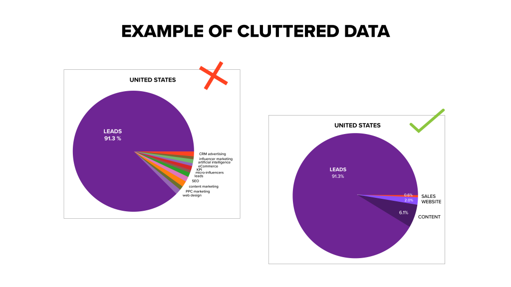
In the above image, we can see that on the left pie chart, the data is cluttered with too many categories. Users can’t make out any of the chart’s information.
But in the right piechart, reducing the number of categories makes the chart clutter-free and easily understandable. This decluttered data is much easier to understand.
Avoid Dead Graphs
Dead graphs are graphs where no information can be extracted. They show little to no variation.
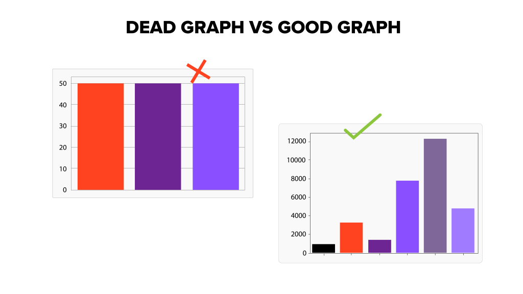
In the above image, we can’t make out any information from the bar graph on the left because it doesn’t have any variation. But the bar graph on the right shows different categories and enough variation to gather important information.
Choose the Correct Visualization Methods
Make sure to choose the correct visualization models for your data. Below, we show two scatter plots, one with usable information (on the right) and one with undefined information (on the left). You can see that choosing the correct data visualization makes all the difference.
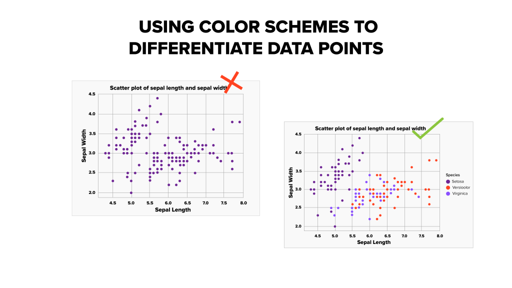
Use Different Colors
We can also see in the above image that adding colors to different target categories adds meaning to the chart. We can more easily interpret information from these various categories.
Avoid Misleading Charts
When not used correctly, charts can be misleading. This might not be intentional, but the marketing analytics team needs to be careful while studying the graphs and be aware of misleading ones.
Data Visualizations Tools
Data visualization tools help businesses garner concrete marketing and sales information. With the proper tools, it’s easy to create beautiful graphs and visualizations.
Let’s discuss some of the top data visualization tools for businesses:
Tableau
Tableau is the most common and popular tool used for data visualization. It is a user-friendly tool and easy to learn and implement. Tableau helps convert raw data into an easily understandable format for quick data analysis. It uses dashboards and worksheets for their visualizations.
Qlikview
Qlikview is a great tool to present the data using a wide range of features. The tool can create more customized data, which leads to effective visuals. Qlikview has many visualization and analytics capabilities with reporting features for your business.
Infogram
Infogram is another great visualization tool that uses templates that you can personalize. The tool’s best features are that you can link real-time data to graphs, which means that the data is always up-to-date.
Sisense
Sisense is a data analytics and visualization platform where you can create visuals for different businesses. This unique platform is user-friendly, efficient, and creative with full control over the customization of visuals.
Sisense can gather all the data from multiple data sources into one place, which is a great way to create more interesting and effective visuals.
Google Charts
Google Charts is another great tool that allows you to create charts based on your data and is a great option for your business. Google Charts has very flexible options for creating engaging visuals and interactive animations.
Final Thoughts
Data visualizations are a great tool to help decipher large amounts of data and improve business growth, sales, and productivity. Visualizations can help the marketing teams advertise the right products to the right regions and they can help the sales team gather data on past customers.
